Design System
A system built to scale
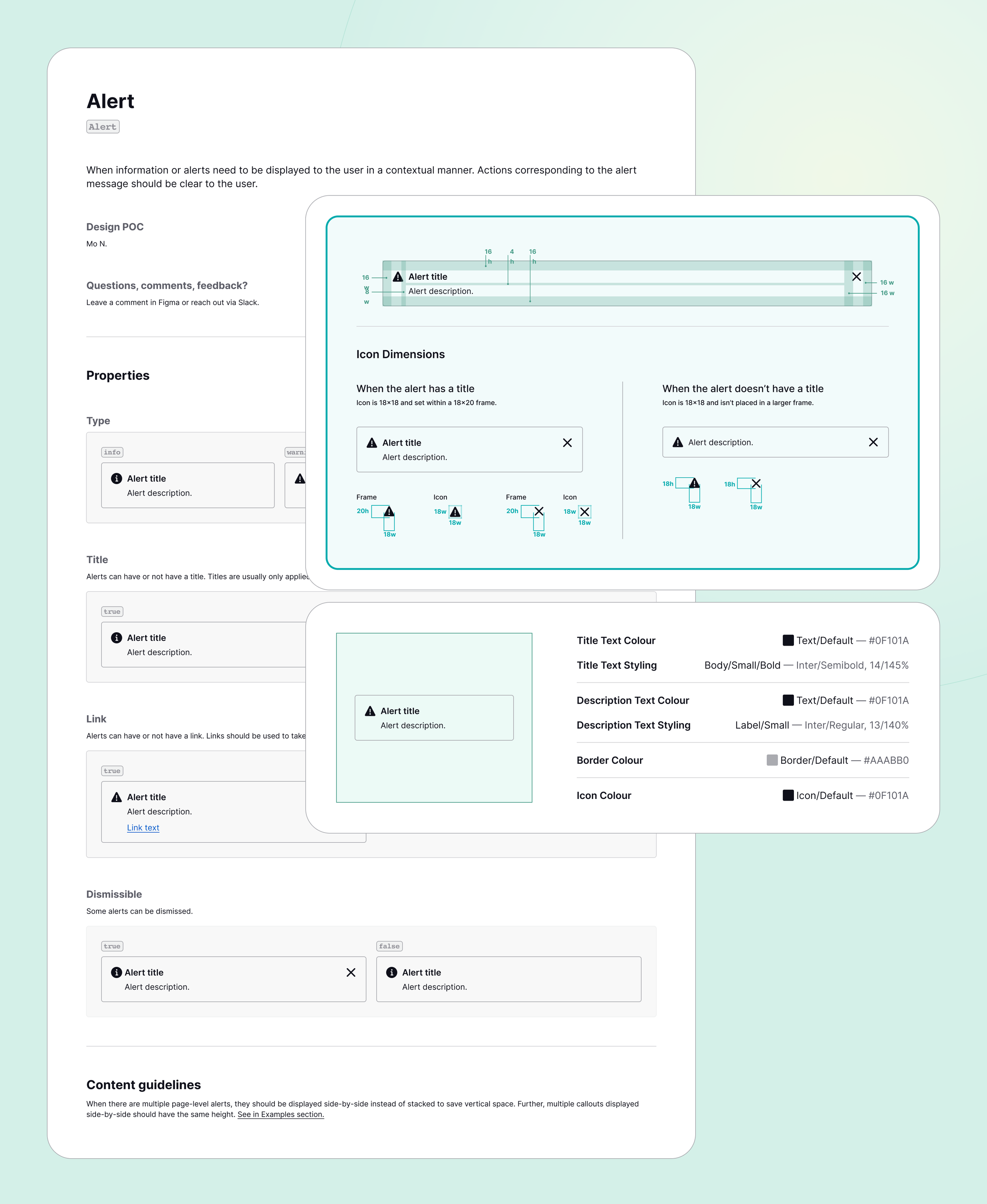
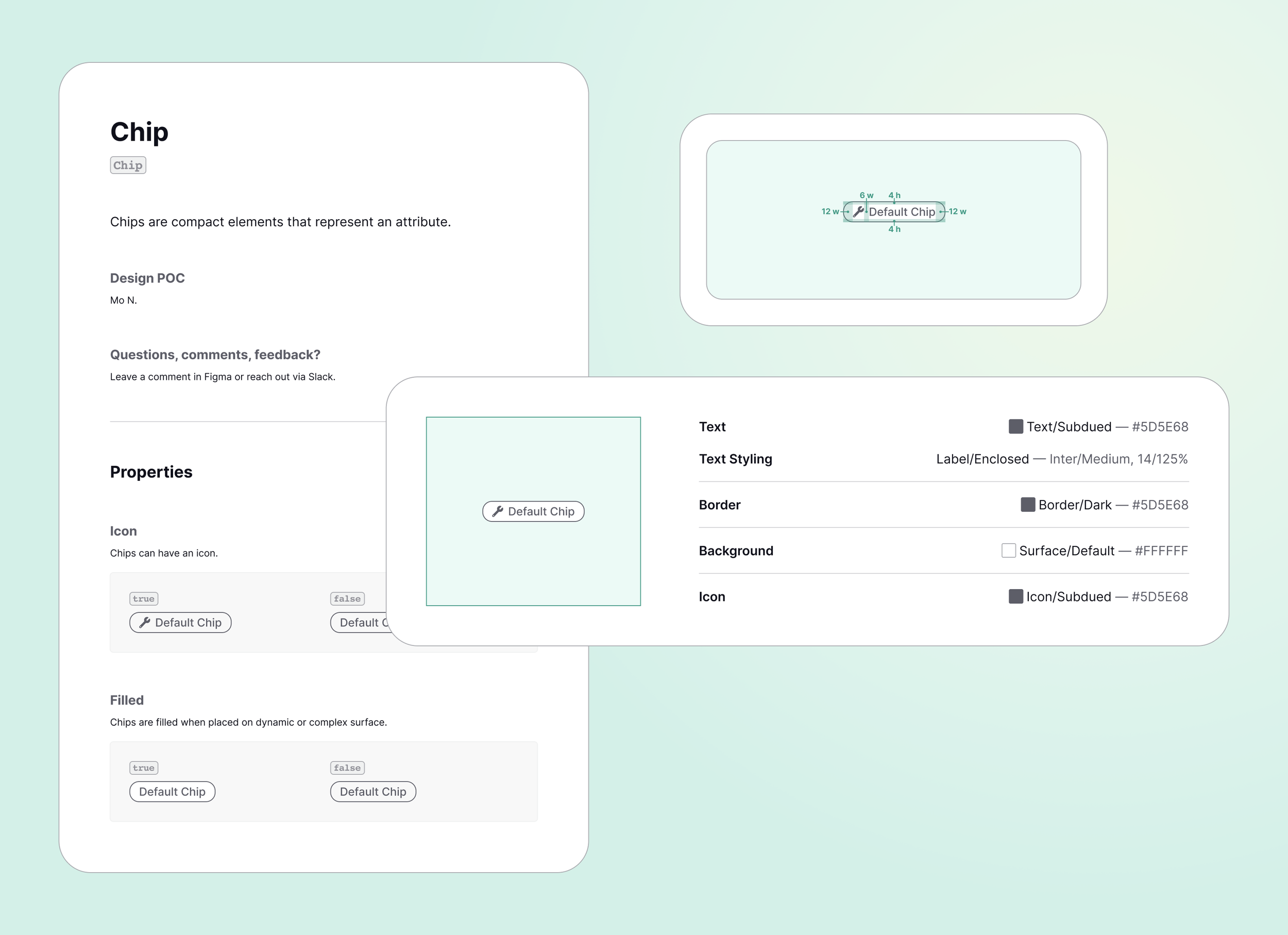
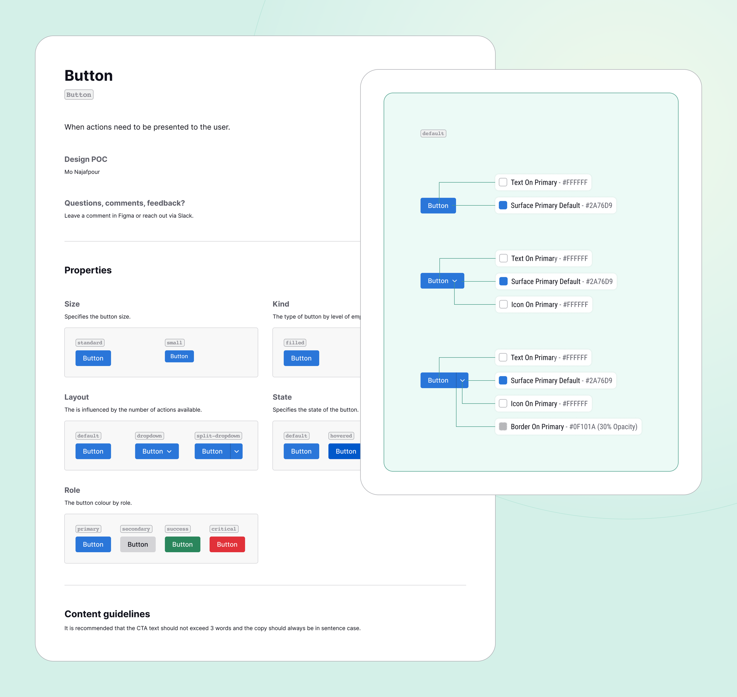
Over six years at ResQ, I built and maintained the product’s component library, creating a consistent foundation for teams to design and build from. What started as a collection of reusable UI components evolved alongside the product—growing to support new features, patterns, and use cases while keeping the experience cohesive across the platform. The system brought together everything from typography, colour, spacing, and foundational styles to complex components and their many states and variations.
More than a library of UI elements, it became a shared design language that helped make designing and building new experiences faster, more consistent, and easier to scale.
Establishing the foundation
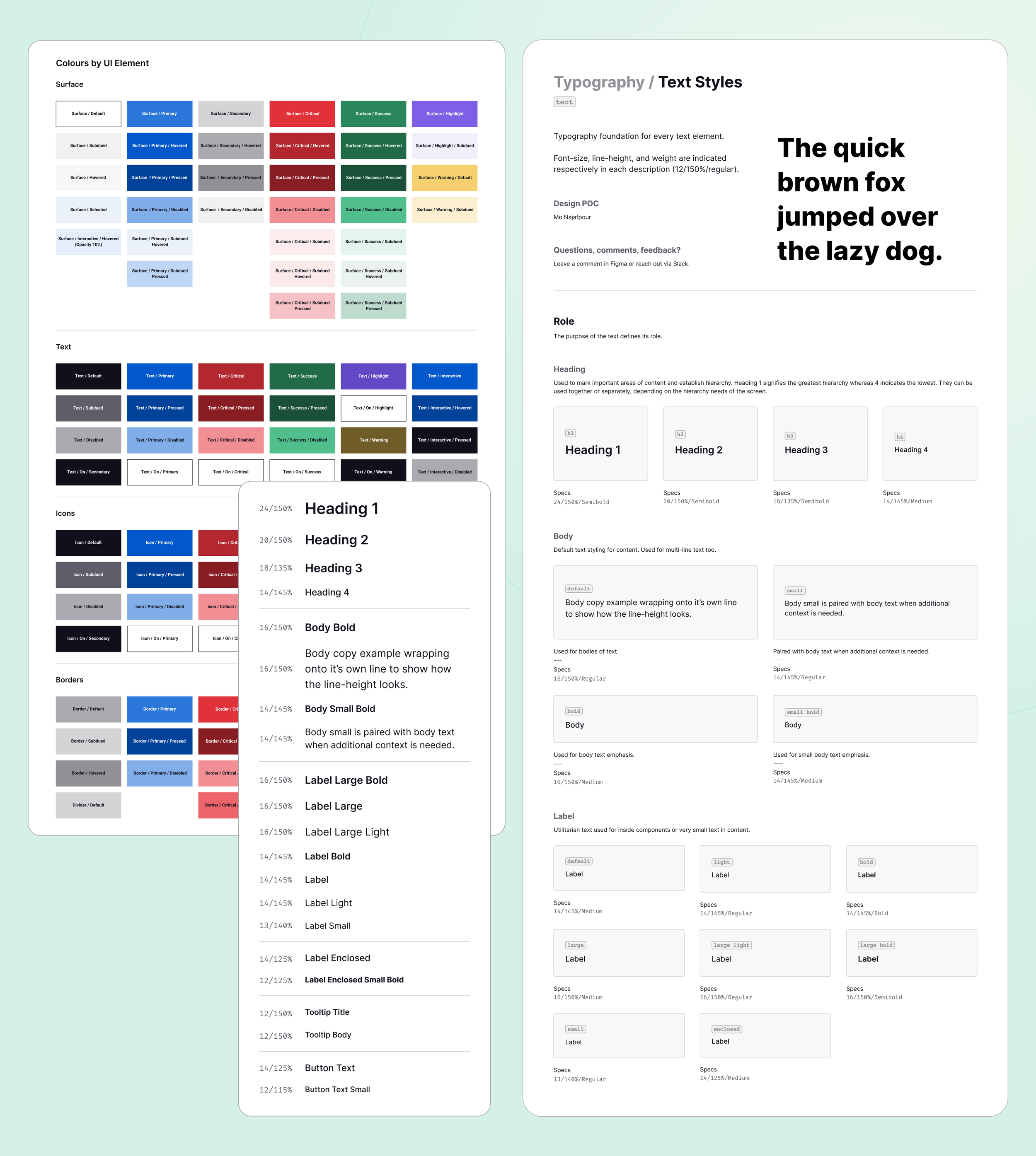
The system started with the fundamentals: typography, colour, spacing, grids, and other visual primitives that formed the foundation of the product. Defining these consistently created a reliable starting point for every component and made it easier to maintain visual consistency as the product grew.
Components that scale
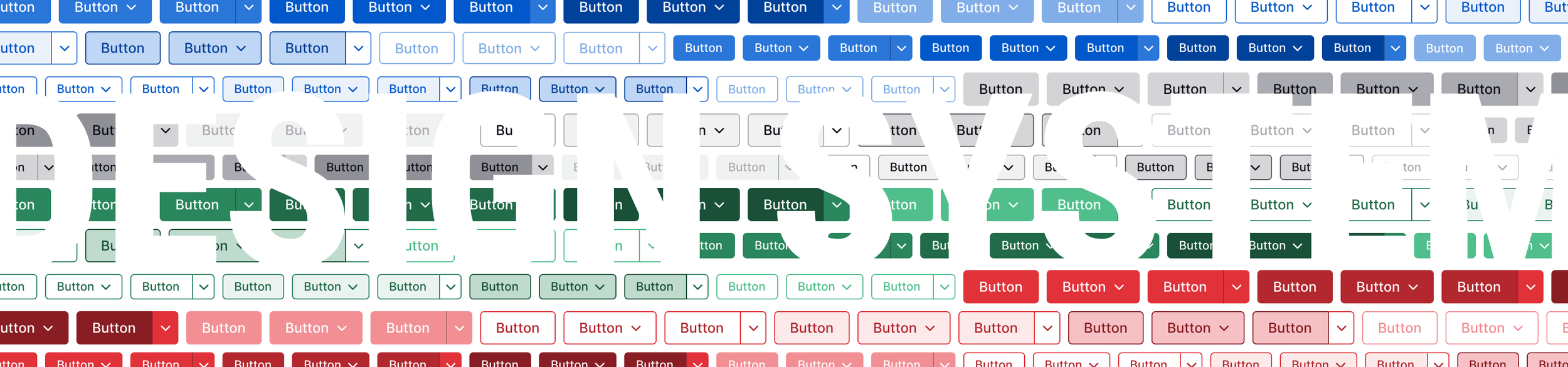
From buttons and form fields to navigation, cards, modals, and more complex patterns, components were designed with flexibility in mind. Each component accounted for its different states, sizes, and use cases, giving designers a set of reliable building blocks without limiting the experiences they could create.