Daily Menu - Dashboard
Context
Vendors were managing a growing number of jobs, tasks, and updates across ResQ. There was an opportunity to give them a centralized view of what needed their attention, while making important information easier to discover without adding to the noise.
The goal
Create a view that gives vendors an at-a-glance view of their day—surfacing items that require action while keeping important updates and information accessible.
The dashboard was organized into two key areas:
Action Required: Items that require the vendor to take action, helping them quickly identify and prioritize outstanding work.
Keep Informed: Useful updates and information that vendors may want to know about, but don't require immediate action.
Defining what matters
A key part of the work was determining what actually belonged in each category. I started by using my knowledge of the product and vendor workflows, then worked with internal teams and vendors to validate what should be considered an action versus something that was simply useful to know.
During the wireframing stage, I scheduled sessions with vendors to walk through early concepts, gather feedback, and understand how they would naturally prioritize information throughout their day. Their input helped shape both the content and hierarchy of the dashboard.
Design principle
Make the next action obvious. The Daily Menu was designed to reduce the effort required to figure out “What do I need to do?” while still giving vendors a place to quickly check “What else should I know?”
Exploring the dashboard
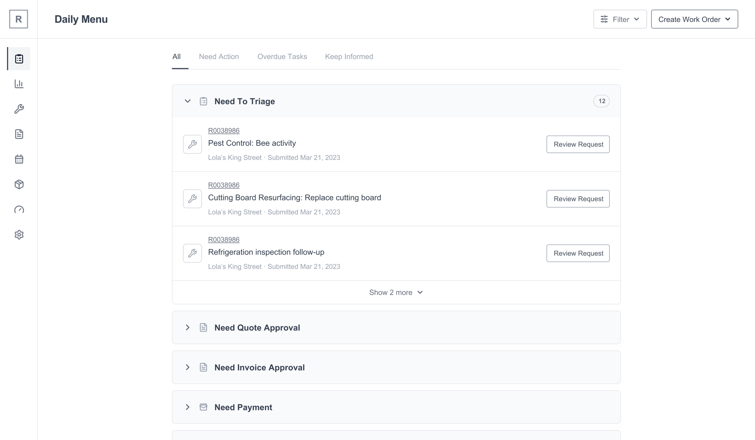
With the key information defined, I explored different ways to structure and prioritize it within the dashboard. I created multiple wireframe directions to test different approaches to hierarchy, grouping, and how quickly vendors could identify what needed their attention. These explorations helped me evaluate the trade-offs between information density, scannability, and ease of use before moving into the final direction.
The goal wasn't to find the most comprehensive layout, but the one that made the vendor's next action the easiest to identify.
Exploration
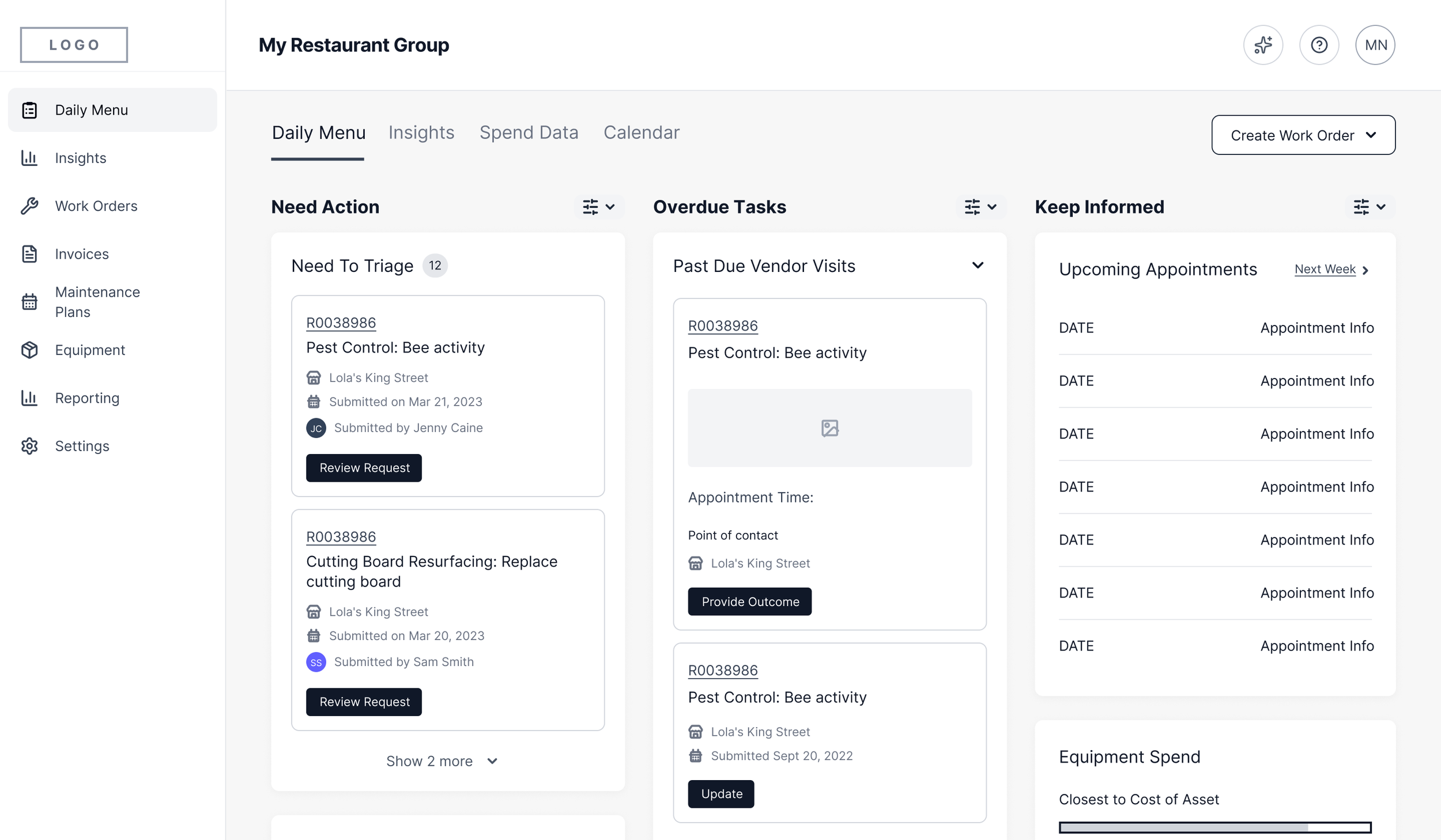
Exploration
SelectED Design
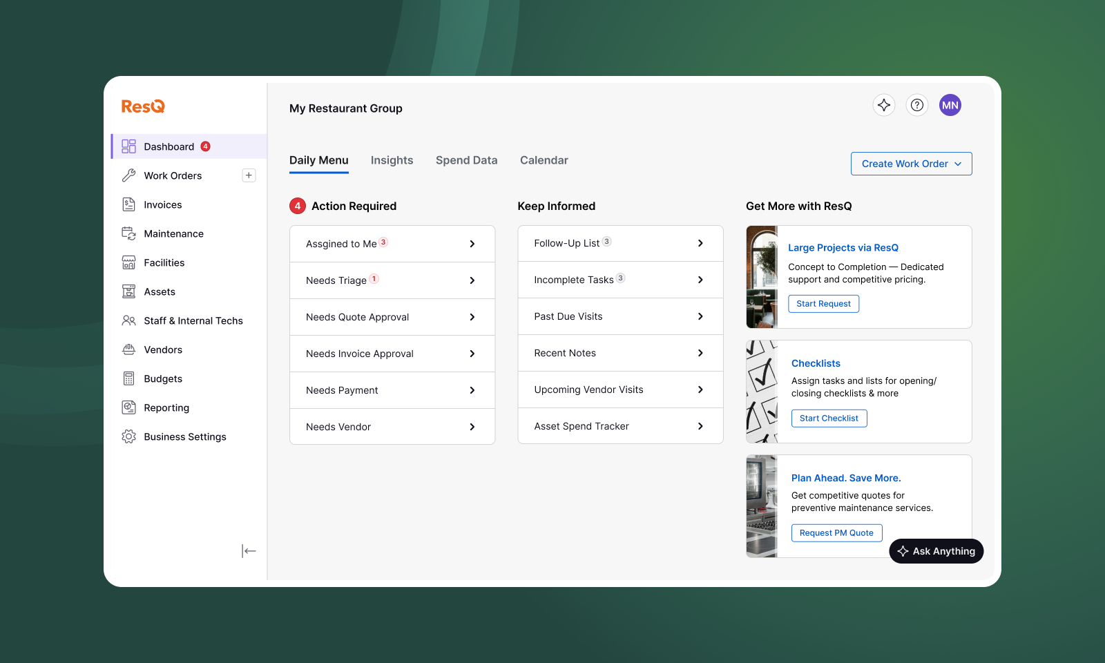
The final design brought everything together in a clear, scannable dashboard—giving vendors an at-a-glance view of what needed their attention, while keeping useful updates and information close at hand. It also created a dedicated space to surface and promote other features within the product, turning the dashboard into more than just a task list.
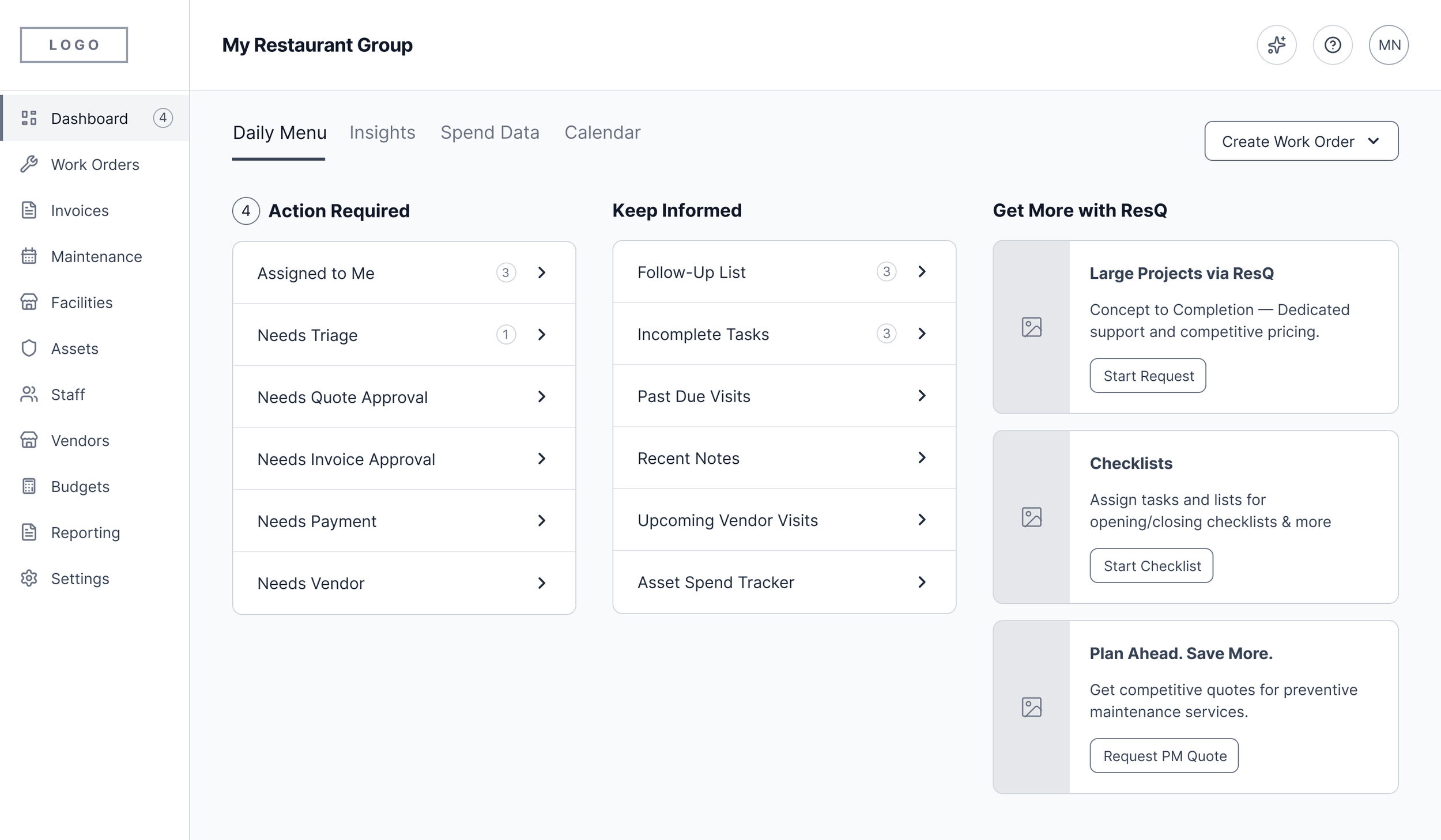
Selected Design
Actionable Dashboard
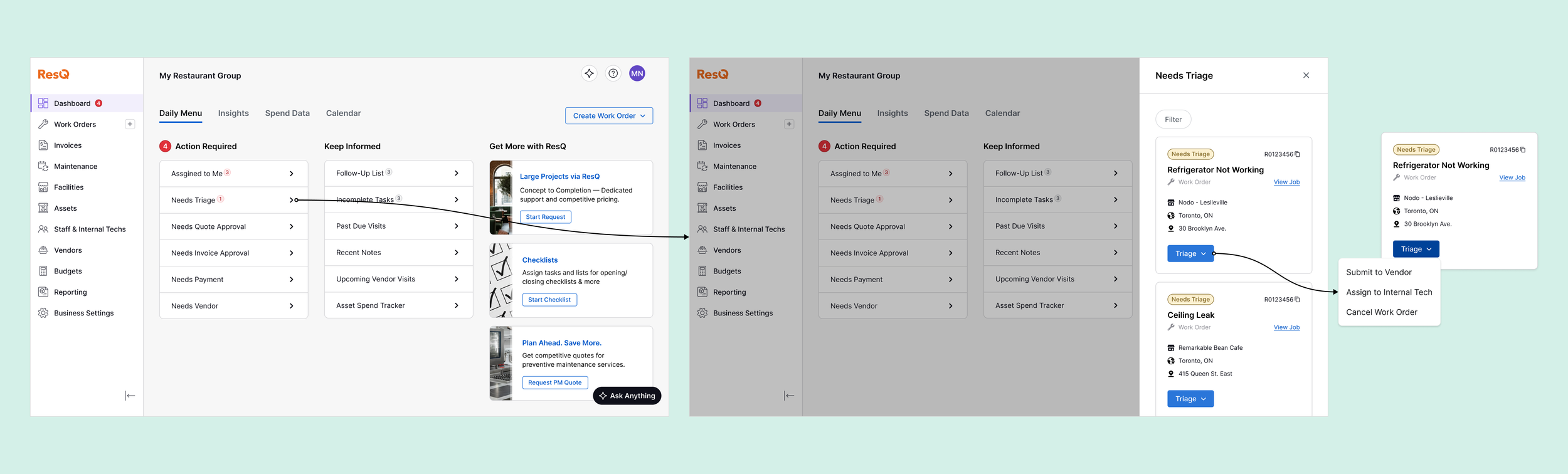
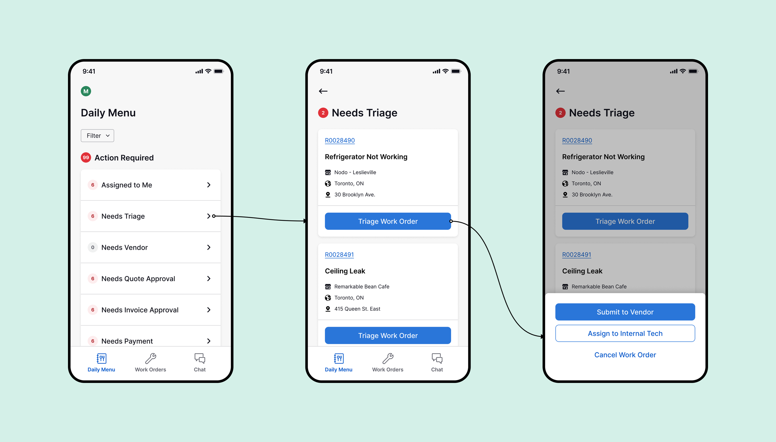
Clicking an action item opens a contextual drawer on the right, surfacing the work orders that require attention. From there, vendors can review and action each work order directly within the drawer. By bringing the necessary actions into the dashboard, vendors can work through their outstanding tasks without navigating away or losing sight of the bigger picture.